Microsoft made the huge annoucement of building a modern workspace for a major renovation of the Microsoft Headquarters. The modernization is promised to come with various projects that will help employees collaborate and create. This is a capstone project collaborated with Microsoft Teams. The project purpose was to identify gaps that exist in open-plan workspace, and to come up with a design solution that could be implemented in the future.
I led the ideation and iteration of the project including all the animation/interative design assets. In addition, I worked alongside a researcher, 2 data scientists in the research and analysis process.
Timeline
January 2020 - June 2020
Role
Design Lead
Sponsor
Microsoft Teams
How might we help non-managers in open-plan workspace find less distracting working environment?
While being widely adopted by tech companies nowadays for its collaboration and teamwork stimulating perks, open-plan workspace is notorious for its recurring issue of noisy and distracting environment, resulting to workers being unble to focus and many other issues.
Roam: Office Space Lookup is a mobile system that provides workers just-in-time list of quieter and/or less crowded office spaces that does not necessarily need booking depends on what kind of working environment the worker is needing at the moment. We validate the need for this design through a thorough research study.
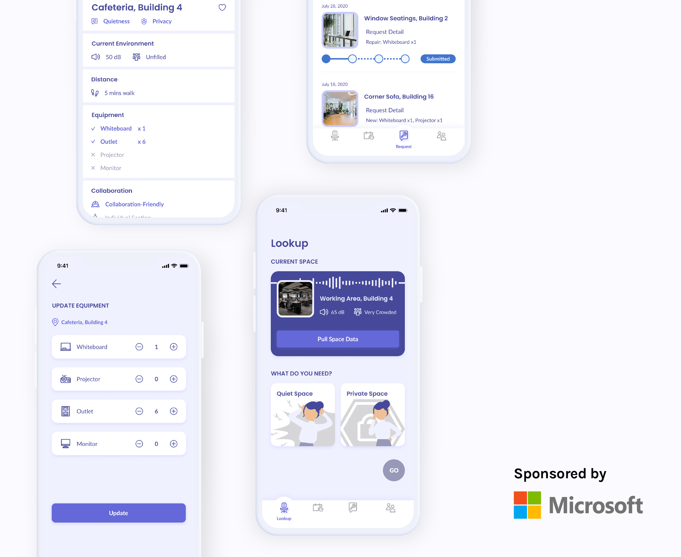
When Jason starts to find his current working environment unbearable, he can look up for other office spaces that are quieter or provide more privacy in one tab.
If Jason happens to know ahead that he would need quietness/privacy, he can plan ahead for his need. The system will count in the plus one to the predicted average level and if prediction exceeds original status, Jason will be notified so he can look for alternative options.
Once Jason finds a space he might want to go, he can view the detail information to help him make his decision.
When Jason notices any differences in the equipment status, he can input his observation. If he happens to have specific request, he can submit a request to the system.
If we really were to return back to office, the companies really will need this app to help sort out the booking mess.
The tech companies have been implementing the practice of open-plan workspace under the benefits of low cost and expected collaboration stimulation. However, what they fail to take into concern are the discomfort and physical effect their employees are enduring under such environment and the resulting productiviy decreases.
While due to COVID situation, the project is currently on hold, if the project continuews in the furture, we estimated that the non-manager employee's NPS score for open-plan workspace and employee productivity would increase, indicating a improved opinions and possibility of recommendation for open-plan workspace.
Narrowing down from big problem space
The project undoubtedly started from a huge problem space I was extremely unfamiliar with. The huge question marks led to vagueness and unsureness. However, with various methods of research, my teammates and I were able to narrow down to identify a specific pain point and start the design process from there.
Think outside the box
Practicality has always been a limit for my creativity thinking. However, with the opportunity to just come up with whatever I can think of and encouraged by Microsoft to do so, my innovation thinking definitely went on an amazing ride. Although in the end, the concept testing pointed us back to a praticical design idea, it was still fun to go wild.
To help understand the millennial's general perception of the open-plan workspace and general feelings of working in one.
To understand the existing research on open-plan workspaces and to help form our research hypothesis. We identified 12 themes fromt the studies.
With the hypotheses formed, we designed a survey to understand the employee's opinions of open-plan workspace and how the 12 themes played parts.
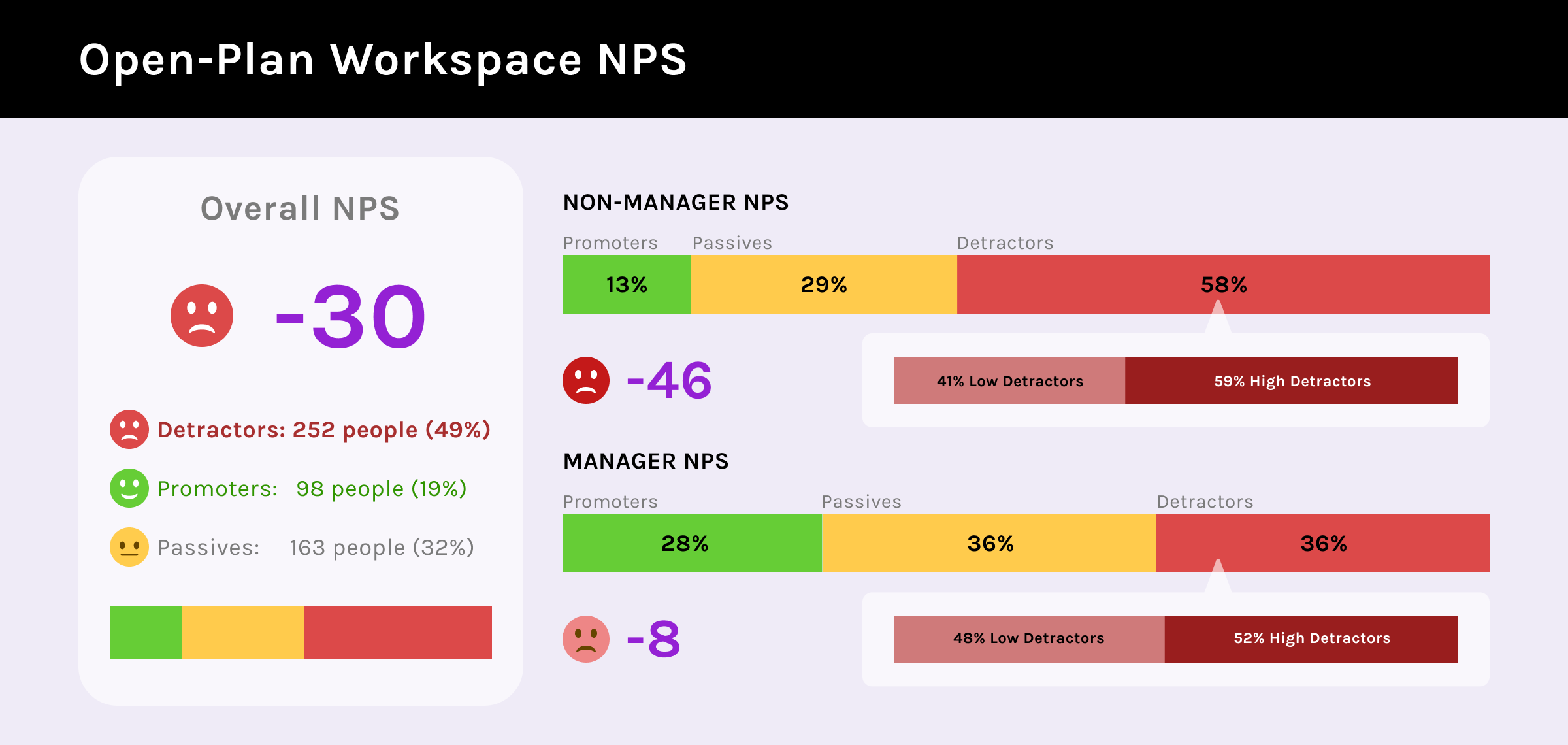
The overall NPS for open-plan workspaces is -30, with non-managers at -46 and managers at -8.
We received over 500 reponses for the survey, which the data analysts performed quantitative analysis on the rich data. We found out that the difference between non-managers and managers' NPS is statistically significant.The non-manager's NPS is at -46, 82% lower than manager. The non-managers also have 22% more detractors of open-plan workspace.
50% of the respondents express discomfort due to noise and lack of privacy.
Out of the 12 themes we identified from literature review, 50% of the respondents express discomfort due to noise and lack of privacy. More non-managers experienced negative effect on health.
It is highly distracting and noisy. The benefits do not outweigh the inefficiency, and I ended up having to look for private spaces.
Non-managers lack controls and decisions in open-plan workspaces.
Managers on spend 22% more time in private spaces than non-managers. More managers also expressed easier access to private spaces. The reason non-manager workers are having harder time being productive in open-plan workspace is partially due to the fact that they have way less controls and decisions of their workspace in open-plan workspace. They need to feel the sense of privacy and quietness.
I would really appreciate it if there is more access to private workspaces. The rooms are always booked, and it's hard for me to get one for myself.
Focusing on non-managers.
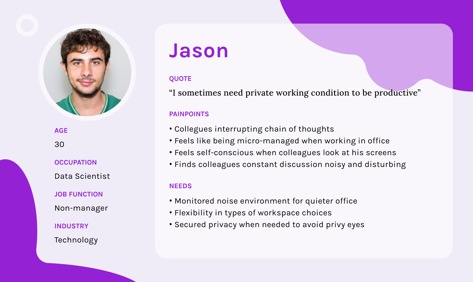
From the synthesized research result above, I created a persona to help me focus on the identified target audience and to avoid loosing sight of the TA's pain points. While we acknowledge the manager workers' perception on open-plan workspace does not entirely align with the non-managers, due to the fact that The non-managers have a significantly lower NPS, and that their needs are more specific and urgent, I made the ultimate decision to focus on the non-manager type of workers for this project.
A response to the sudden change on time limitation and situation.
After brainstorming design ideas for Jason, we ran into the unforeseen COVID situation and resulting schedule changes. We did not have the capacity to carry out our original usabiloty testing. In order to still collect some user feedbacks on the design ideas, we decided to conduct unmoderated concept testing to validate our problem assumption and solutions.
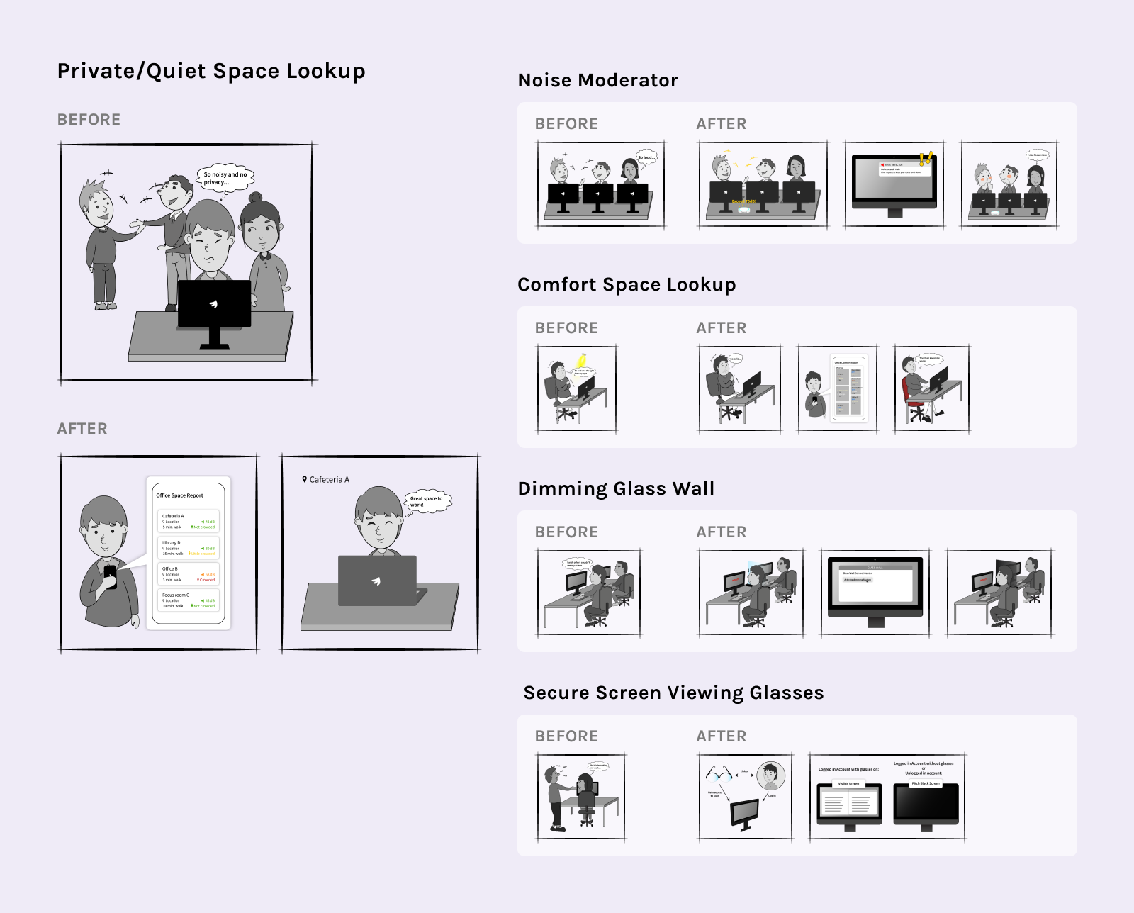
I drew the storyboards for the tested 5 ideas to help communicate our ideas to the participants.
Difficulties in finding a private or quiet place to work
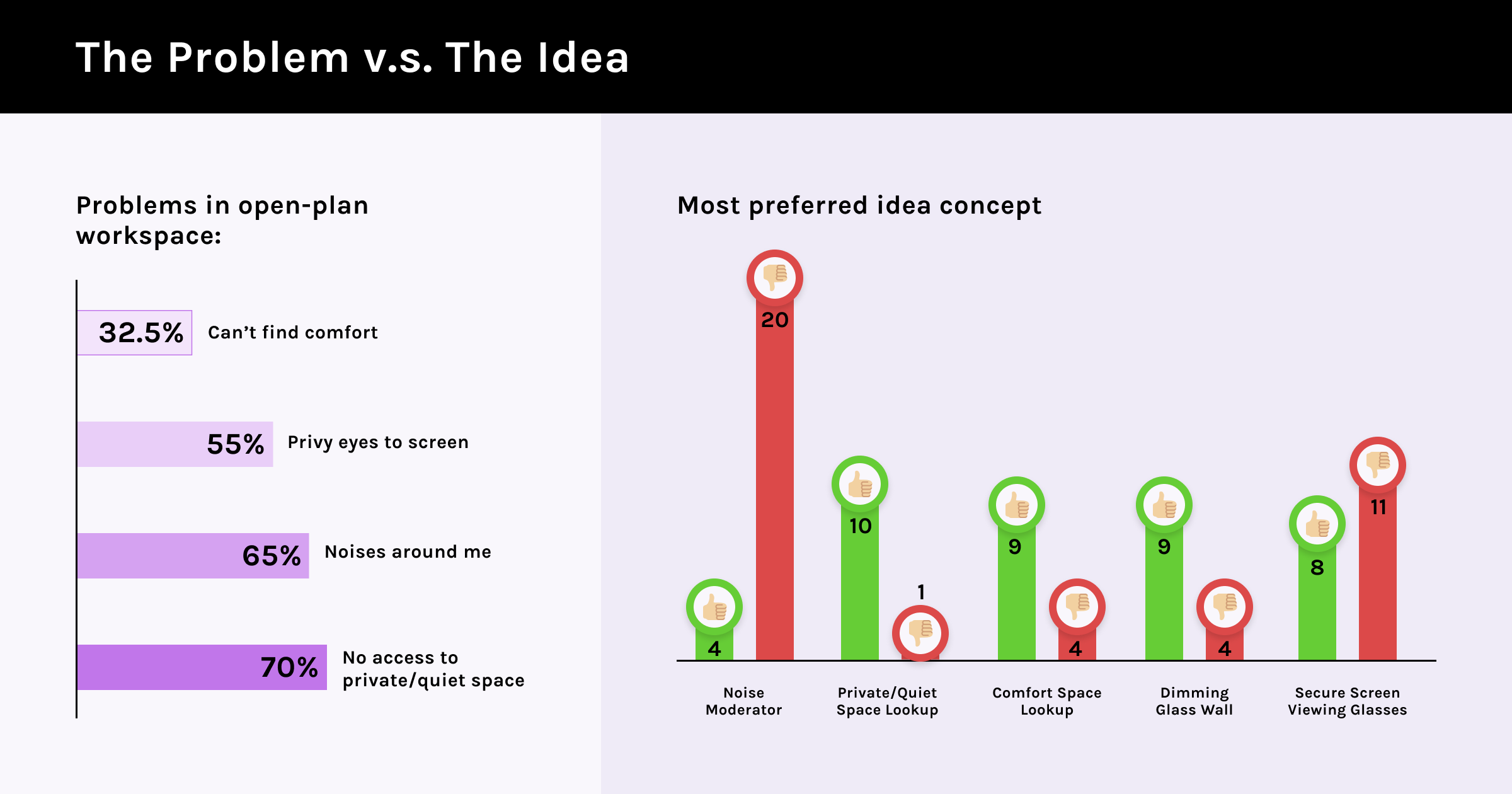
To validate the contributing reasons behind the problems identified in the research phase and to make sure the ideas are solving the problems, we asked the participants to rate how the problems the design ideas aim to solve are affecting them. 28 out of the 40 participants either agree or strongly agree that they find it hard to find private/quiet space, ranking the most agreed issues out of the other 4 problems tested.
Treading carefully in the micro managing zone.
A major feedback we gathered from the concept testing is the danger of micro-managing. As workers, no one wants to be managed closely at all times. From Microsoft's point of view, the company also doesn't want to represent a micro-managed culture. While some ideas inherently are micro-managing, some other when designed carefullly can avoid this. To avoid micro-managing naturally became a design challenge I had to focus on during the iteration phase.
Being told to keep my voice down has a negative feeling as if I were still in middle-school. For this reason, I don't like the idea even though it might be straight to the point.
Feedback for the noise moderator
Acknowledging the idea limitation.
Private/Quiet office space lookup system was the highest rated idea and was also the final solution we proceeded with. However, a major limitation of the idea reside in the situation where the workers are unable to work on laptop, and hence being tied to desks. We acknowledge the flaw, but decided to proceed with it because our users reported it as the most prevalent problem and recognized its "no booking needed" as a differentiating feature.
During the decision process, I came upon some design challenges I had to make, below are a few of them:
Website v.s. Application? Desktop v.s. Mobile?
Immediately after we had our idea decided, I had to make the decision on where should the design reside? Should it be web-based or should it be a application on its own? The reasoning for our final decision are:
Reasoning
While website has its perks of being compatible through different devices, I ultimately opted for an application because we needed to push notification in times when a plan's prediction has changed.
Reasoning
While most users are working on desktops and having a desktop application would be faster to access, due to the use cases such as users riding on a bus to their work and deciding to use the system, we decided to focus on mobile app for now. In the future, a desktop version might also be considered for the smoothest transition in work.
How might we ensure users of their data privacy and avoid micro-managing vibe?
Aside from micro-managing, data privacy is also an issue I had to design for to ensure the users felt comfortable using the design. Aside from the actual system operation, which is behind the scene, it is important to design for addressing the users of their privacy concerns.
I designed a series of instruction cards to be shown during on-borading process and for when the users need reassurance to help transparently inform the users of their data privacy concerns.
Utilizing Onboarding
How might we provide smooth workspace transition with minimum disturbance to the workers' workflow?
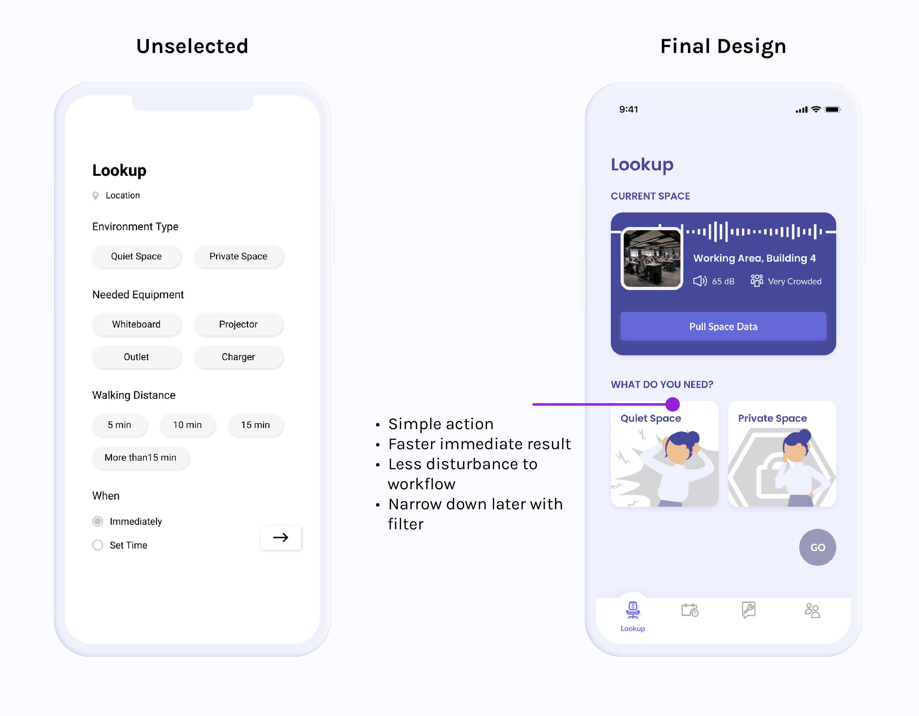
Since there is a high chance the design will be used in the middle of a work day, I didn't want the task needed to complete the search to be too complicated. Aside from the inevitable moving workspace process, I want the task to be as simple as possible while still providing accurate enough search list for the users to seamlessly change their workspace.
I debated between a detailed form search and a simple one tab search paired with filter functions for narrowing down the the list. Fundamentally, there is no difference between the two, but the latter design can quicken the first search, and if the workers have specific needs, they can then filter the list.
How might we upkeep with the equipment status in those non-booking workspaces?
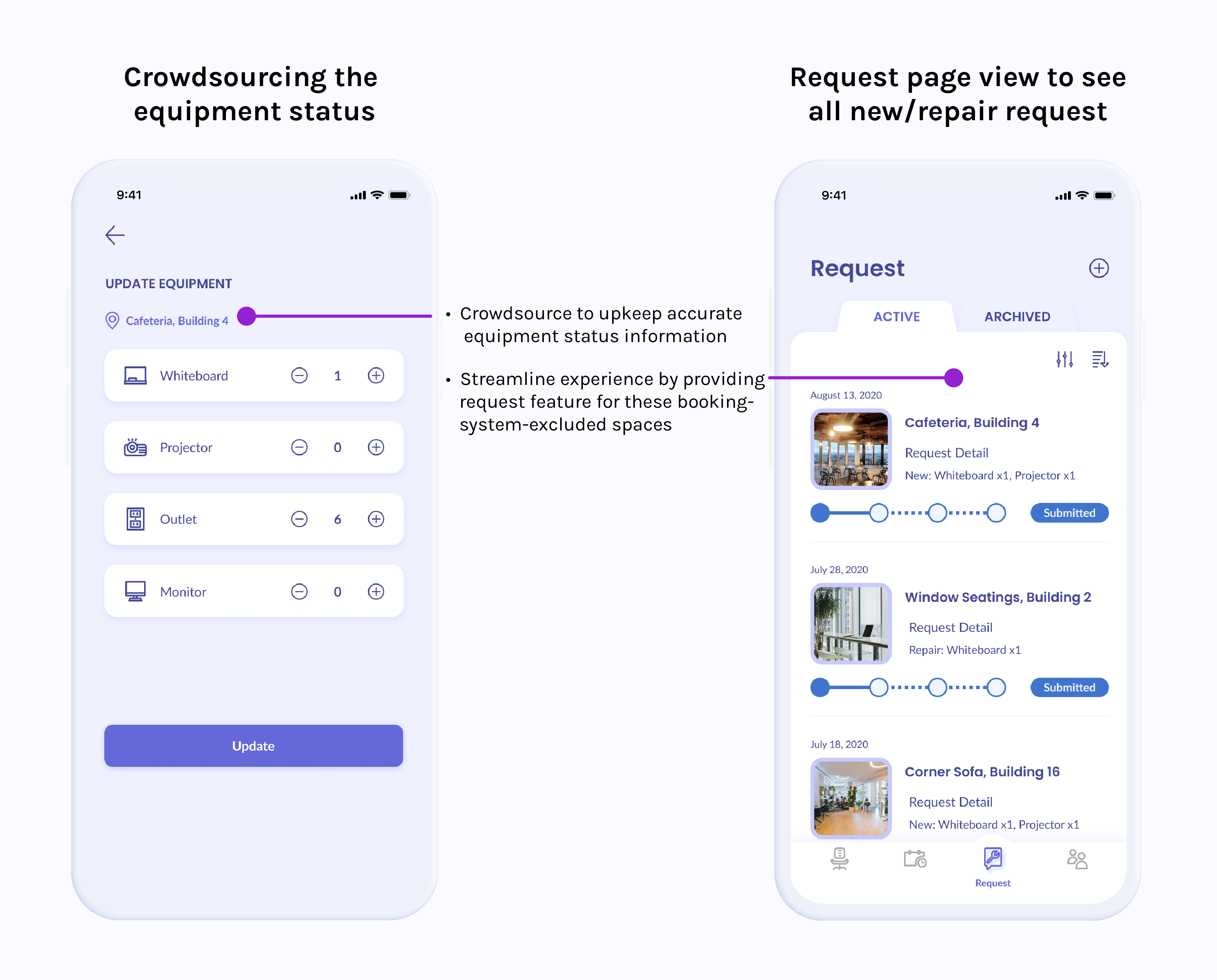
Equipment avaiable is a key aspect to a workspace especially when collaboration is in the picture. However, for spaces that do not need booking, equipment status becomes an issue because the space is not under constant monitoring. I decided to adopt a crowdsourcing method and rely on the users to contribute the information when they deem fit to help provide the most accurate information for other workers.
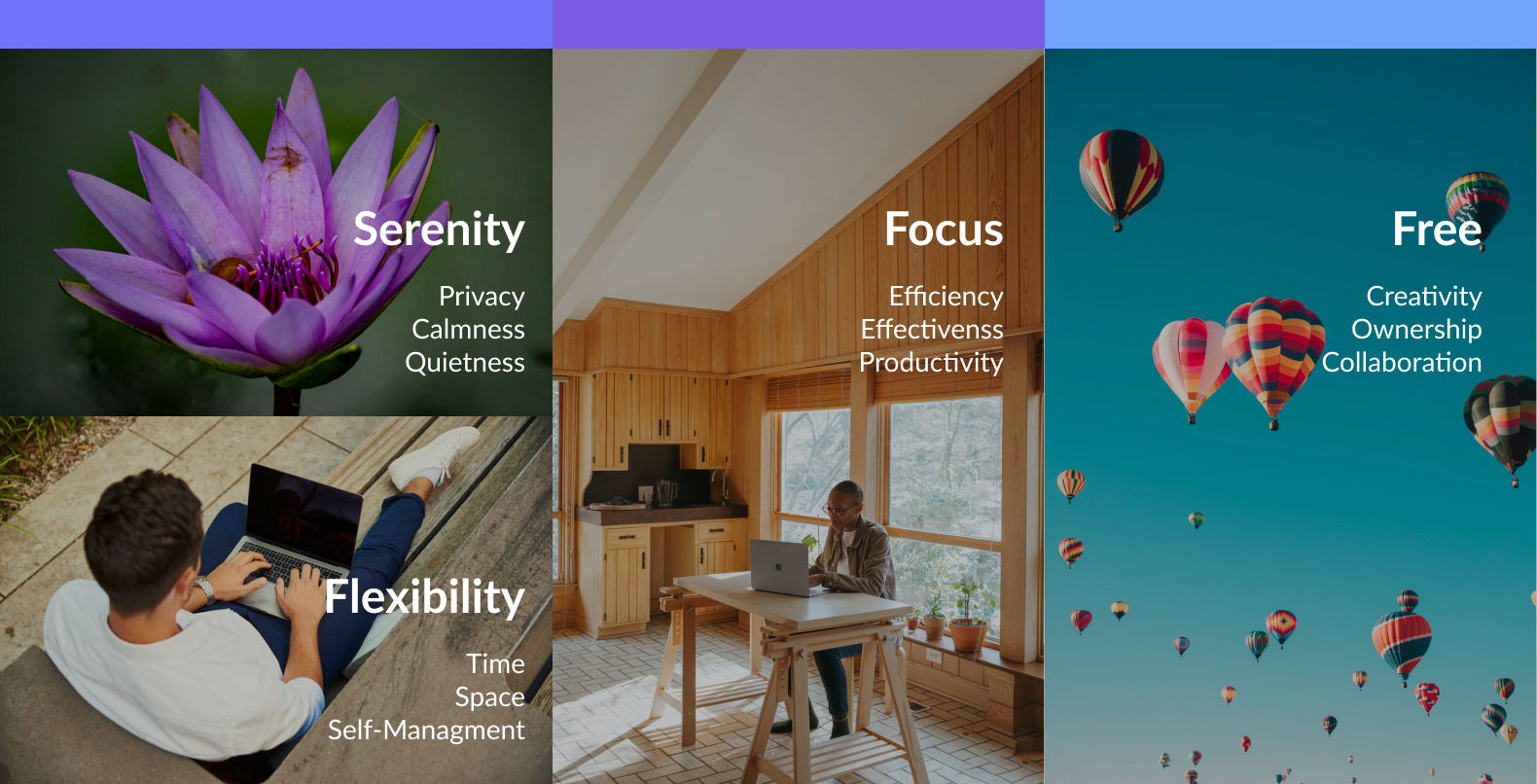
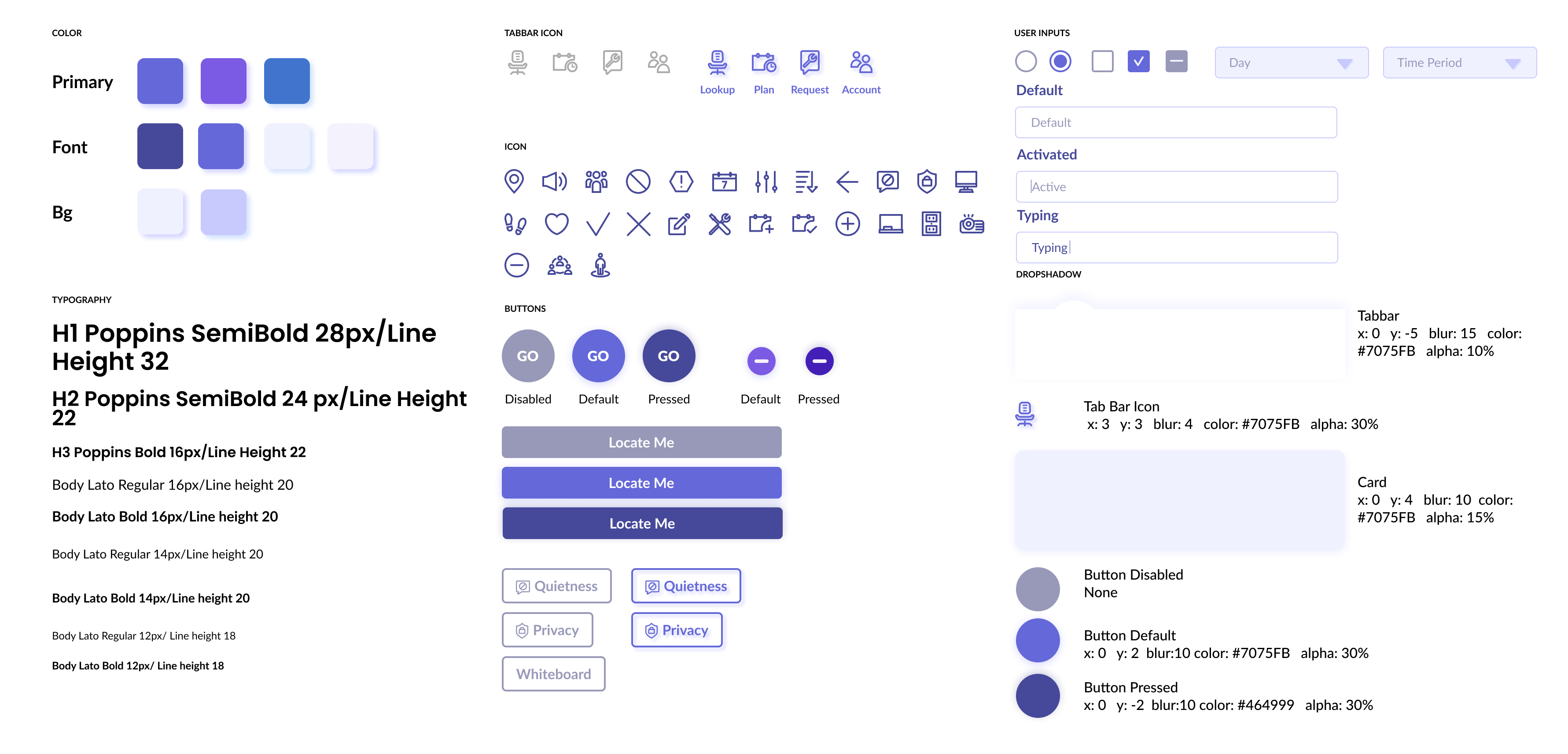
I created the design system based on the moodboard and design principles that best represent the message Roam wants to send out.
My team will continue to coordinate future plans with Microsoft. Once the COVID situation ends, we will bring up the idea to present the research and design to the Modern Campus team. Hopefully we will be able to conduct a moderate wizard of oz usability testing on the design by then.