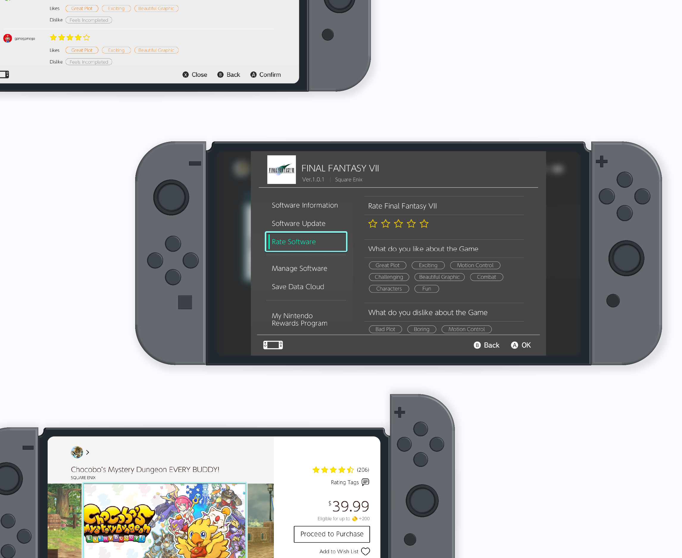
Ever since the Nintendo Switch came out, users have been constantly expressing how time consuming it is to browse through eShop. This project focuses on proposing a new rating and reviewing feature for eShop to help enhance the shopping and browsing experience on the console.
Timeline
February 2020 (2 weeks)
Role
UX Designer, User Research
Context
Personal Project
How might we improve information circulation between the eShop system and users and between the users themselves?
Users has been expressing their dissatisfaction with Nintendo Switch's notorious eShop system. They have a hard time depending on the eShop information and browing the eShop for desirable games. The users complained about spending too much time trying to locate games they might like and that the information on the eShop is not informational enough to help make decisions.
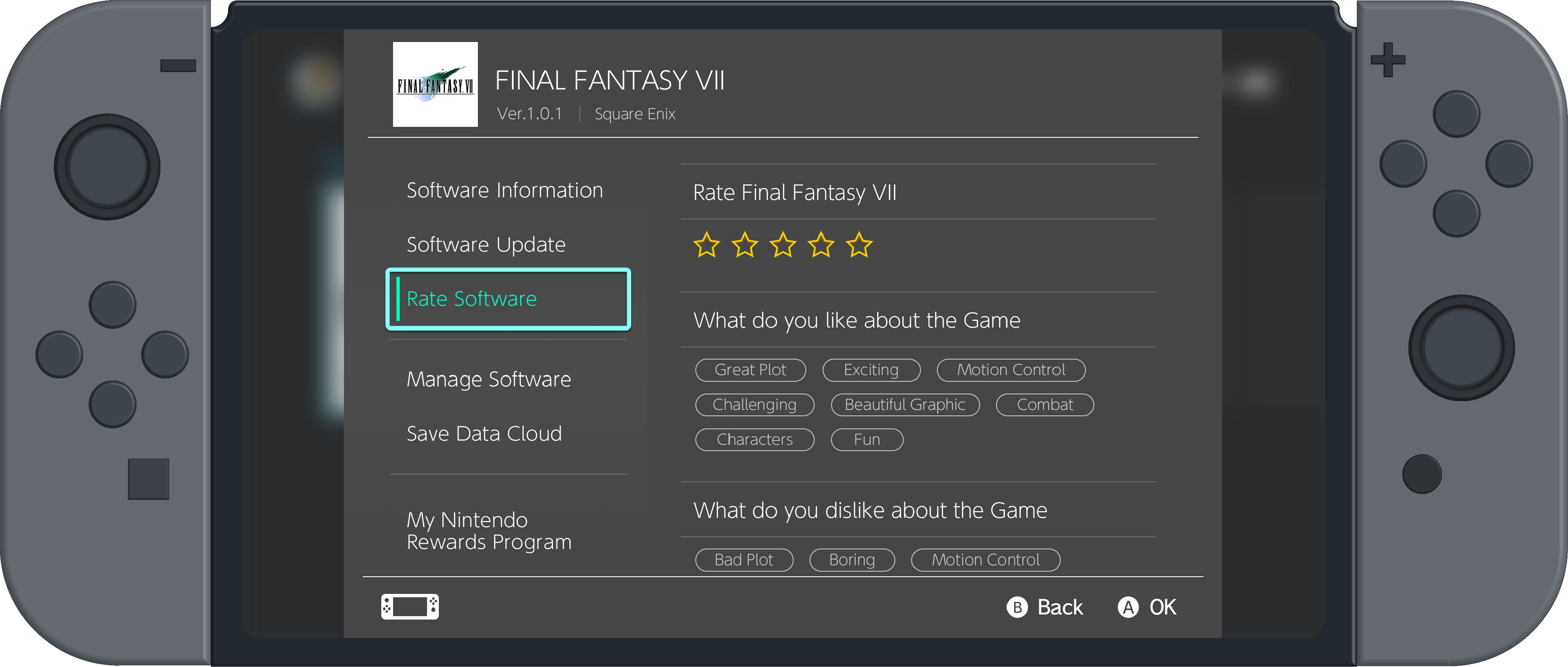
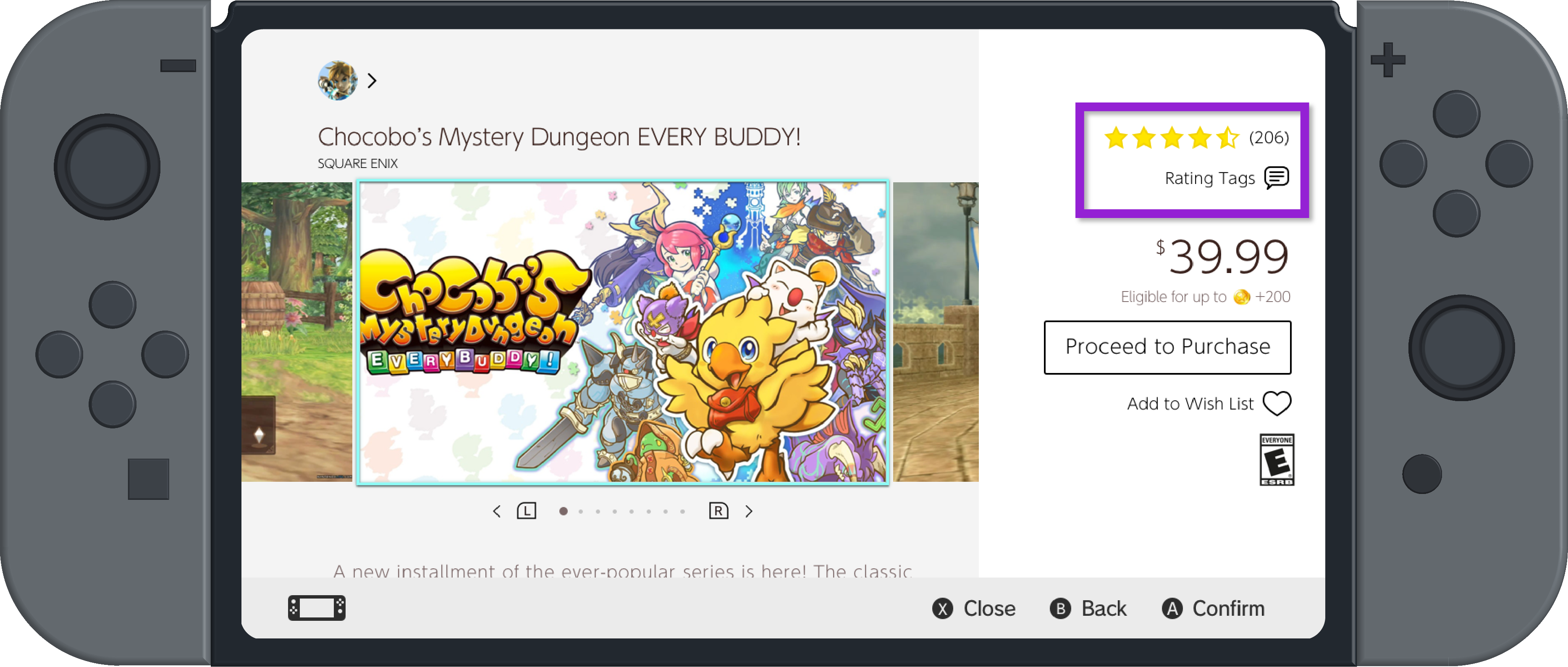
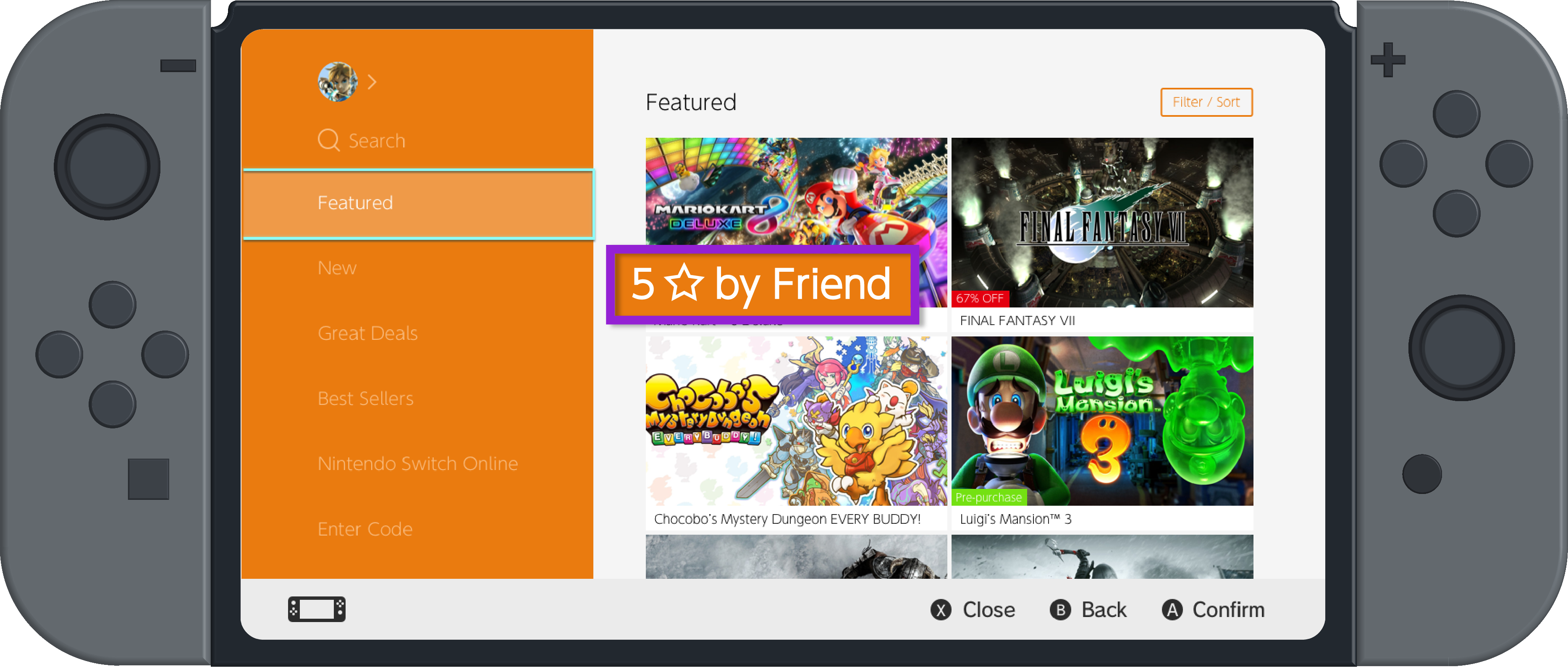
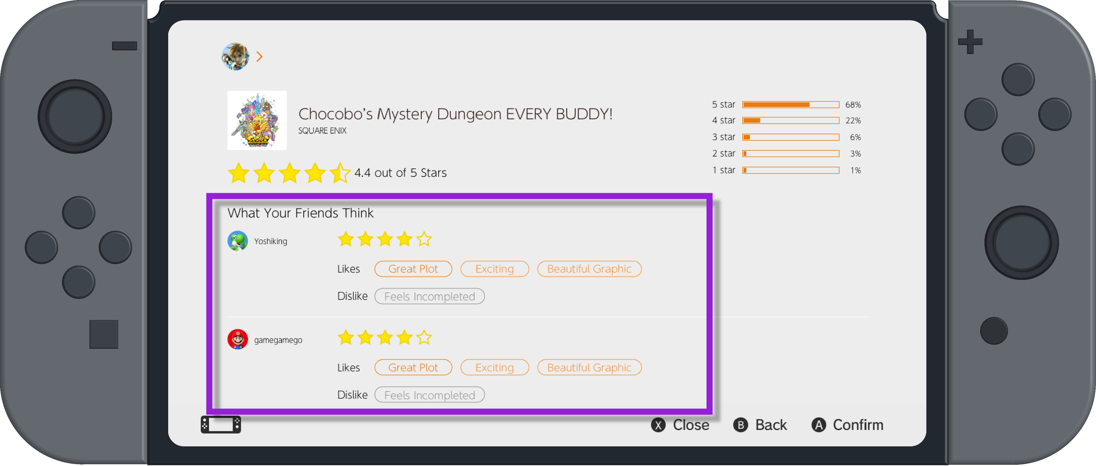
Nintendo Switch eShop game rating system is a new set of feature that allows users to rate their exprience with each game they own and to browse other reviews and ratings for the games they are considering buying. The new feature will provide and circulate information for users to help improve the browing experience of the eShop.
Shortened decision making time and potentially more confident purchase decision.
I recruited 5 switch owners, and ask them to browse through a set of games that are under $25 with fake rating datas available with prototypes. 3 of the participants spent less than 20 minutes going through the prototype before telling me they have identified a game they would like to buy. The other 2 expressed they would still need more information before making the decision. In comparison to the contexual inquiry results, the design significantly shortened the timing and simplified the process needed for users to make a purchase.
* Accroding to research, pricier games require longer consideration time and more information to make decisions.
When typing is not easy?
Switch is not a typing-friendly device. This is my first time designing under such limitation. It was challenging yet interesting to have to design and make decisions around such limitation. However, I do think user testing could be conducted to help analyze whether it is necessary to keep the input process within the console only.
Designing with younger audience in mind
Nintendo has always have a wide range of audience age. There are many younger audience in Switch and this indicates extra attention needed to monitor the use of language when user-generated content become accessible. It was a growing experience for me to design a child-safe feature.
I visited a couple Switch forums to conduct initial secondary research of how users generally think of Switch eshop.
I talked with a couple Switch owners to learn about their habits browsing and buying games from the eShop.
I assigned them a task of finding a game (under $25) on eShop they would be interested in buying to observe the interaction.
The overflowing game selection makes it difficult for users to browse for game
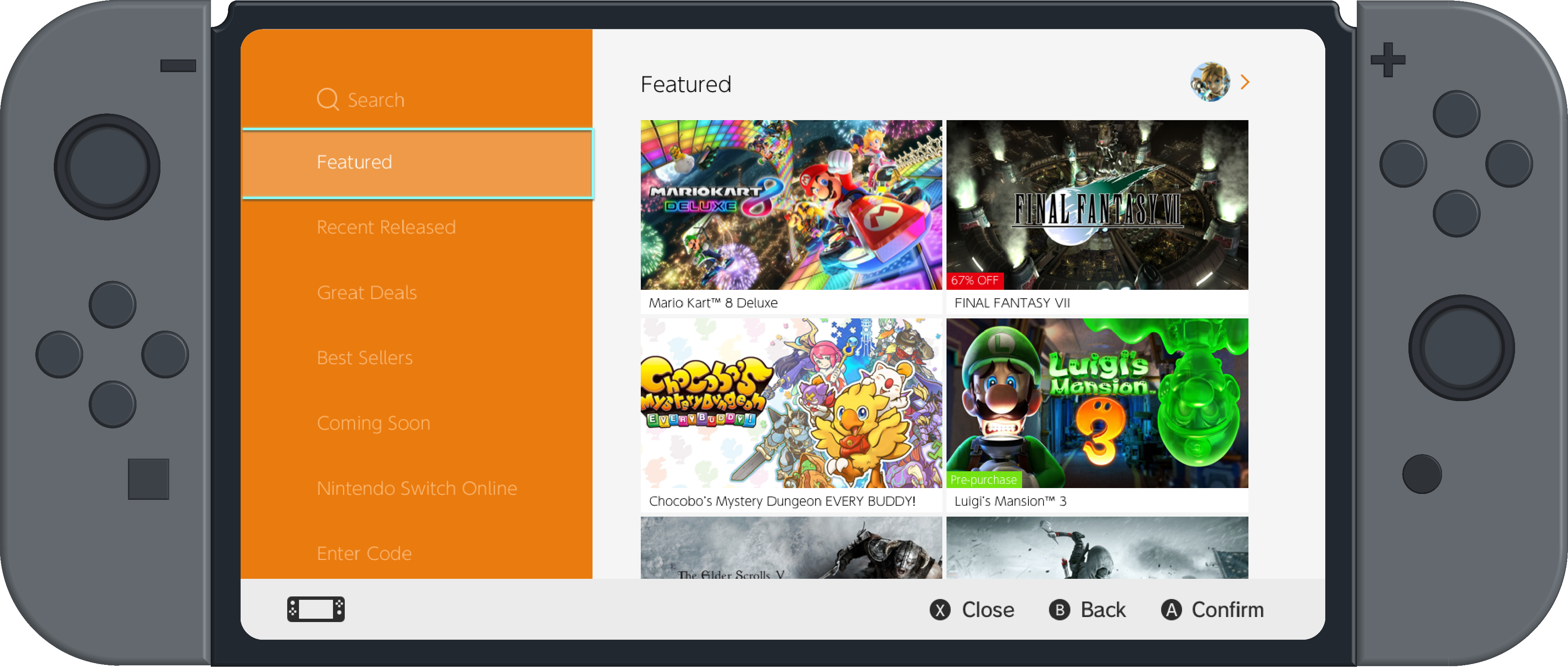
eShop is full of all kinds of games ranging from big AAA games to indie small games and the amount of games will only grow more as time goes on However, the current navigations are not powerful enough to help narrow the search to users' likings.
Current Design
Unhelpful information on the individual game page
The information on each individual game are just generic descriptions that are not helpful enough for the users to make a quick decision on low price games based solely on eShop.
I feel like Nintendo didn't utilize their real-estate. Like I don't really scroll further down game information but it takes up 2/3 of the page.
Word-of-mouth drives the final decision making.
The users rely on word-of-mounth information from their friends a lot. Word-of-mouth information either fueled the ultimate buy or defuel it.
I rely a lot on friend's opinion. I would say it's usually what my friends say that ultimately drives my decisions.
Designing for a specific device
While brainstorming for solutions, I had to keep in mind that Switch is not a mobile device nor a desktop device, and hence many functions and interactions we are familiar with when designing for mobile/desktop/tablet might not work the same or even exist on Switch. In order to help me generate ideas that are feasible for the Switch console, I came up with a couple principles as a guideline.
Informative Resource
Child Safe content
Easy Interaction
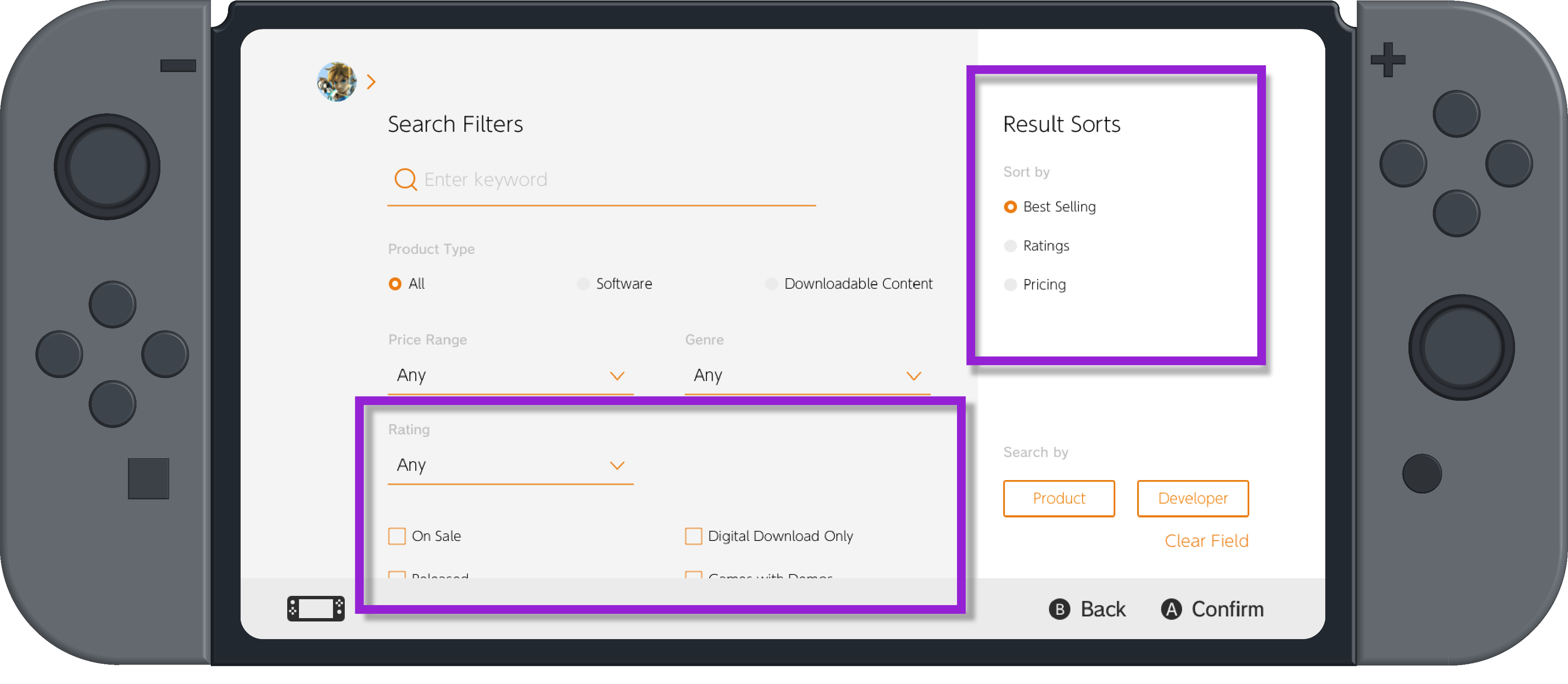
The final selected ideas I settled on were a rating/review system to improve user-generated information circulation and flow paired up with showcasing the users' friends' reviews/rating on the games to achieve the word-of-mouth effect, and to redesign the filter function for eshop.
Comparing current rating/review system
With the idea selected, I decided to conduct some competitive analysis to help me form some understanding of current practices on the rating/review system.
Pros
Cons
Pros
Cons
Pros
Cons
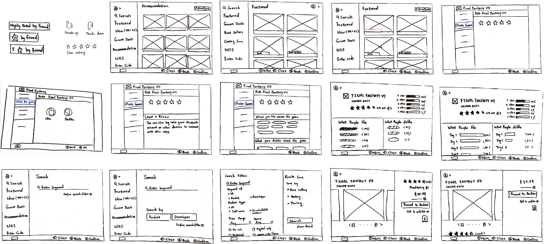
During the iteration, I sketched out various design and layout to help me solve the design challenges and compare the pros and cons of the possible design options.
During the decision process, I came upon some design challenges I had to make, below are a few of them:
Star Rating v.s. Thumbs-Up/Thumbs-Down
The debate between a 5-star system versus a binary rating system is one of the main design challenge for this project. I summed up the two options' pros and cons as listed down below. Ultimately, I decided to opt for 5-star rating system because every single purchase action on Switch is a more complex and costly commitment in comparison to selecting a video to watch and then being charged as a whole each month for a much lower price. 5-Star rating system will served a much more informing resource.
Pros
Cons
Pros
Cons
How to work around Switch's typing-unfriendly nature?
Like mentioned above, star rating system works great with qualitative reviews. It provides content and explanation behind the otherwise potentially ambiguous star rating scale. However, Switch is naturally typing-unfriendly, and expecting the users to type out their reviews word to word on the console is just bad design. I came up with two idea: 1. Cross-device review system and 2. Tag selection. I went with the tag selection design in the end.
Pros
Cons
Pros
Cons
The visualization of overall ratings and reviews
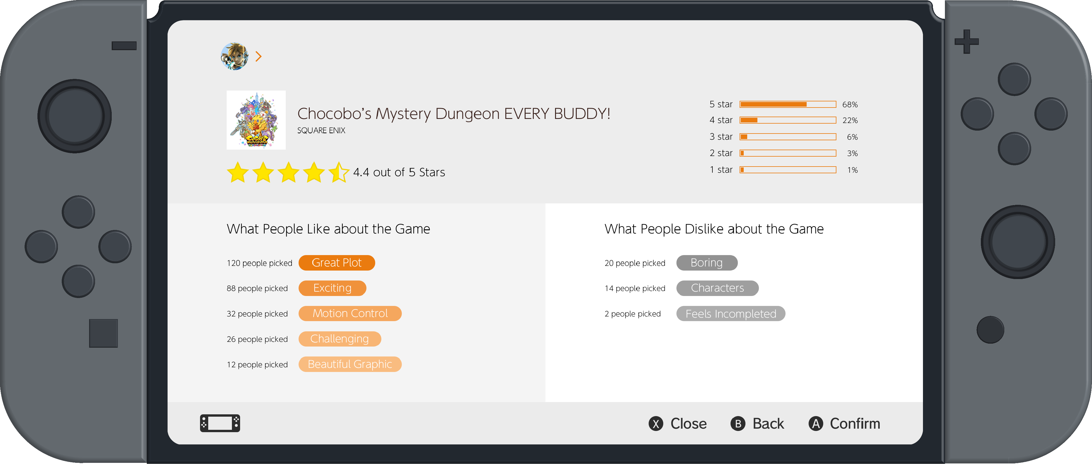
With the tag selection design decided, I then came to the challenge of how I should visualize the aggregated tag selection. The goal here is to inform user which of the descriptors are the most commonly applied to the game, and thus served as the qualitative content of the good and bad aspects of the game. I considered between visualizing the time selected comparison of each tags with bar graph style and gradient style. Ultimately I decided to use the gradient method:
Reasoning
Ratio issues between wide range difference on limited screen space does not exist for gradient, and since gradient itself already does not provide a spatial quantitative comparison, it will serve its point as long as it highlights the most selected ones and is being paired with the actual percentage number.
Reasoning
Various descriptors can be selected to describe one game, and this could run into the issue of the most selected ones being too long and disrupting the correct ratio for all bars, and thus misleading the spaital comparison.